
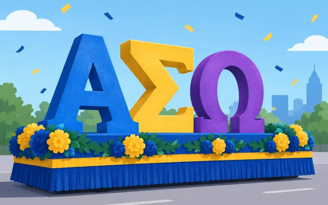
A Greek-letter float has to make its point before the crowd has time to read the fine print. Whether you are decorating for a fraternity, sorority, school spirit group, alumni chapter, or Greek-themed event, foam Greek letters give your float a clear focal point that can be seen from the curb, bleachers, and judging stand.
The best foam Greek letters are not simply large letters attached at the last minute. Their size, color contrast, placement, and mounting all affect whether they look crisp in the parade or disappear into the background. A little planning early on saves volunteers from trying to fix a tilted letter or weak color combination on parade morning.
Start With the Message People Need to See
Greek letters usually carry the identity of the group riding or sponsoring the float. That makes them one of the most important design elements, not an accessory. Before choosing a size or color, decide where spectators will first see the float. A front-facing sign, side panel, rear display, or raised backdrop may each need lettering handled differently.
For most parade entries, the clearest approach is to use the organization’s Greek letters as the main visual statement and keep extra wording short. A chapter name, anniversary year, homecoming theme, or event message can support the letters, but it should not compete with them. If every surface carries a message, nothing reads well from a distance.
Think about the float as a moving sign. A letter that looks oversized on a garage floor can look exactly right once it is several feet from the crowd and surrounded by floral sheeting, fringe, riders, props, and traffic. When in doubt, favor readability over small decorative details.
Choosing the Right Size of Foam Greek Letters
Letter size depends on the space available and the viewing distance. For a compact banner, golf cart, trailer rail, or tabletop event display, smaller letters may be all you need. On a full parade float, however, letters need enough height and width to hold their own against the rest of the decoration.
Measure the finished area, not just the bare trailer. If a side panel will be covered with floral sheeting or fringe, measure the space after allowing for borders, swags, and trim. Leave a margin around the lettering so it does not feel crowded. A tight row of letters can be hard to read, especially if the float moves past spectators quickly.
A useful test is to mark out the letter area with painter’s tape, cardboard, or newspaper. Stand back across the room, then look again from the far end of a parking lot if possible. This simple step helps volunteers see whether the letters need more breathing room before materials are ordered.
Keep Proportions in Mind
Greek characters have shapes that vary more than standard block lettering. Wide letters such as Omega may need additional horizontal room, while slimmer shapes can leave open space around them. Plan the complete set of letters together instead of estimating each one separately.
If the letters are being placed on a patterned background, allow even more space around them. A solid-colored panel behind the lettering often makes a better presentation than placing letters directly over busy floral sheeting, metallic fringe, or a mix of several colors.
Use Color Contrast, Not Just School Colors
It is natural to begin with fraternity, sorority, or school colors. Those colors should absolutely guide the design, but matching colors alone does not guarantee visibility. Navy letters on royal blue, purple letters on dark green, or metallic silver letters on white may look nice up close while becoming difficult to read from the street.
Choose a background and letter color with a clear difference in lightness. Dark letters typically show up well on white, yellow, silver, or lighter floral backgrounds. White or bright letters can be especially effective on deep blue, black, red, purple, or green. Glitter accents and fringe can add energy around the letters, but they should frame the message rather than cover it.
For a classic Greek-letter presentation, use one main letter color and one contrasting outline or background color. This is easier for a volunteer crew to assemble than a complicated multi-color pattern, and it photographs well. If your organization has two primary colors that are close in value, use one for the letters and bring the other in through garland, puffs, fringe, or trim.
Give Letters a Strong, Flat Surface
Foam letters need a stable place to sit. They look their best when mounted on a flat signboard, a smooth float wall, or a well-supported backdrop. Attaching them to loose fringe or uneven tissue decoration can make edges lift, corners bend, and letters look crooked.
Build the letter panel before it goes on the float whenever possible. Lay the letters out on the ground, measure the gaps, and take a quick photo once everyone agrees on the arrangement. Then secure the complete panel to the float structure. This is usually faster and neater than trying to space individual letters while people are standing on ladders.
Your mounting method should match the base material and parade conditions. Foam letters can be attached with an appropriate adhesive, double-sided mounting material, staples where a hidden support allows, or mechanical fastening through a backing board. Use enough support to hold the letters against vibration and wind. Avoid relying on a single point of attachment, particularly for larger pieces or letters with narrow sections.
Plan for Wind, Weather, and Transport
A float can look perfect indoors and still face a bumpy trailer ride, strong wind, or damp weather outdoors. Check every letter before leaving the build site. Press gently on edges and corners, and reinforce any part that shifts.
If rain is possible, keep decorations covered until they are ready to install and avoid placing delicate paper details where water will collect. Foam Greek letters make a dependable central feature because they retain their recognizable shape, but the surrounding decorations and the mounting surface still need attention. Transporting the float carefully matters just as much as building it well.
Make Greek Letters Part of the Whole Float Design
The lettering should lead the eye, with other decorations supporting it. A strong arrangement might place the Greek letters in the center of a floral-sheeting panel, then use fringe along the lower edge and festoon/garland around the border. For a tall backdrop, letters can sit above a themed prop, such as a trophy, crest, graduation cap, mascot, or anniversary number.
Do not be afraid of a little open space. Parade decorators often feel pressure to cover every inch of a float, but a clean field around foam letters makes the whole design look more polished. This is especially true for homecoming floats, where riders, banners, and costumes already bring plenty of activity.
If your group has a longer name or a slogan, place it below the Greek letters in smaller lettering. The main letters should remain the first thing people see. From a judging perspective, that clarity helps the theme register immediately.
Order Before the Last Build Weekend
Lettering is often one of the final items people think about, yet it affects the size and layout of everything around it. Order foam Greek letters early enough to measure the actual pieces, test the arrangement, and make any adjustments before your main decorating day.
For urgent projects, reliable fulfillment makes a real difference. ParadeFloatStuff.com has supplied float builders for generations and offers same-day shipping on qualifying orders placed before 2:30 PM Eastern. Still, it is wise to account for transit time, weather, and the possibility that your committee changes the design after seeing the first layout.
Before placing an order, confirm the exact Greek characters, quantity, color plan, available mounting space, and whether the letters need a backing panel. It is also helpful to assign one person to approve spelling and letter order. Greek organizations know their letters by heart, but a second set of eyes prevents a costly last-minute mistake.
A parade float does not need a complicated message to make an impression. Give your foam Greek letters a clear background, secure mounting, and enough room to be seen. When the trailer turns onto the parade route, those familiar symbols will do exactly what they should: tell the crowd who is proud to be there.